
Website Design
The Guide to Responsive Web Design in WordPress
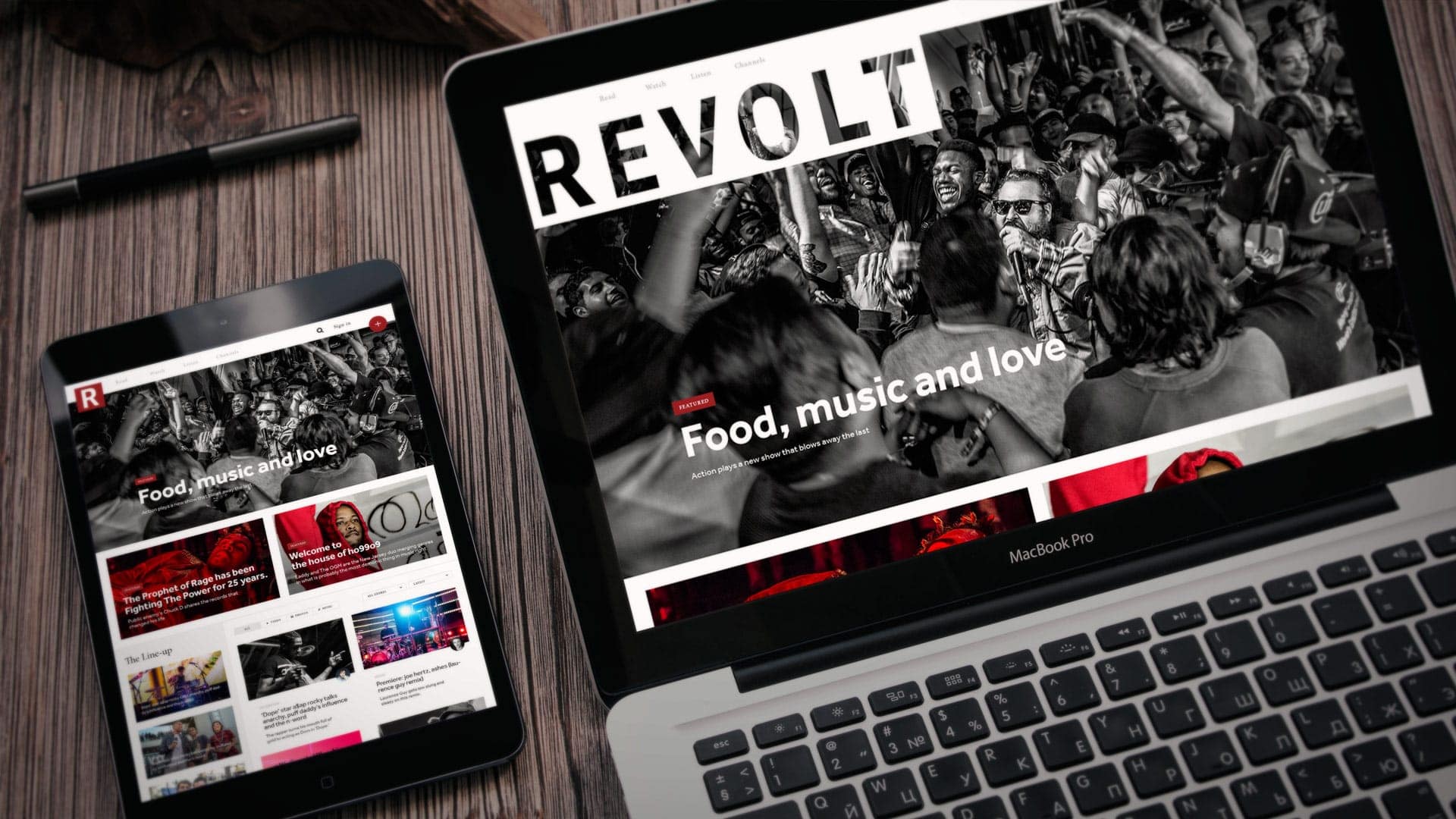
In a world where many people are accessing the internet via mobile devices, responsive web design has never been more...
As with all kinds of other technology, even websites need to evolve in order to meet current demands. The trend right now is for websites to boast of what is known as “responsive web design”. Websites with responsive web design are becoming the norm today and if you’re not keeping up with this requirement, you’re making a huge mistake.
So, here are some of the reasons why you need to start considering responsive web design, but, before we go into that, let’s look at what exactly is responsive web design.
Well, responsive web design refers to a design format wherein websites are developed to adapt to varying display sizes. You see, the average person isn’t just accessing your website through their desktop. He/she probably uses his/her mobile phone or tablet to do the same.
As a result, they would like your website to be viewable on all these devices. Responsive web design helps with this need. The earlier solution was to create different websites for different display sizes, which was a complex endeavor.
Now, you’re probably wondering how this is all possible? Well, as expected, it all starts with code. Back in the day, developers relied upon the multiple code base. In other words, each version of a site had a specific code that helped it adapt to a particular layout.
However, today, we use a single code base, where a single code helps sites adapt to all kinds of layouts. So, even if a site is accessible through a single URL, it has varying style sheets. Each style sheet has a structure that allows modifications based on the device that is being used to access the website. For instance, if the site is being viewed on a smartphone using the portrait orientation, the structure will allow modifications that result in a vertical, top-down layout, which is ideal for the current scenario. Even font-sizes can be scaled to improve readability.
One of the first improvements you will notice with responsive web design is that your website will start to look good on any device. This could be a laptop, PC, tablet or mobile phone. Needless to say, this results in customers or visitors enjoying a positive user experience.
They don’t have to pinch and zoom like they had to or squint their eyes to read the textual content. Responsive web design optimizes everything to provide the best experience possible. The positive user experience in return helps you minimize your bounce rates and boost your conversion rates.
If you haven’t kept up with the recent statistics on mobile usage, you’re in for a surprise. GSMA puts the number of mobile devices being used at 7.22 billion. Yes, you read that right; there are 7.22 billion mobile devices on this planet. That’s more than the number of actual people who live on this planet, which is 7.19 billion.
Now, it would be safe to assume that many of those people use their smart mobile devices to surf the internet and access websites. In other words, your customers are all on mobile devices and they rely on it more than they rely on any of their other devices.
If you intend to keep them paying attention to you, you have no option but to go the responsive way.
For example, in the UK, a company called Ofcom found that the average smartphone user uses his/her device for about two hours a day. This included using social media, general browsing, banking, and even online shopping.
As we mentioned earlier, businesses would run two or more websites, each designed to work on a particular device. Now, there was no option back then. Companies had to rely on this method. But, you don’t have the same excuse today.
With responsive web design, you can make the same website accessible to all devices. It’s a foolish thing to still operate separate websites for each device. What you’re doing is being highly inefficient. You’re incurring additional costs and also, forcing yourself to go through the trouble of dealing with multiple websites.
Responsive design comes highly recommended by the most popular search engine on the planet – Google. According to Google, responsive sites perform far better than regular sites in terms of search rankings. This is because they provide a much better user experience.
Another interesting feature is that responsive sites use single URLs whereas traditional sites have specific URLs for each device type. What that means is you need to have the mobile-friendly URL to open the same site on a mobile device. Using the desktop-friendly URL won’t open the site on your mobile device. Responsive sites don’t suffer from such limitations. They have single URLs that can be opened on any device thereby saving time and more importantly, improving the searchability of the site.
Also, Google uses separate algorithms for its mobile searches. So, if you have a desktop site that is ranked high in desktop search results, it doesn’t mean you will enjoy the same ranking in a mobile search. This is a big deal considering that mobile searches have taken over desktop searches by a huge margin. In other words, the desktop version of your site isn’t even showing up on mobile searches.
In order to ensure that your business remains relevant, you need to stay ahead of the competition. Adapting to the need for responsive sites is one major requirement in that regard. As more and more people begin to use their mobile devices to access the internet for their needs, you need to do what’s necessary.
According to a recent study, around 85% of users believe that mobile sites need to be just as good or better than their desktop counterparts.
At Crafted, we have a team that includes some of the top designers and developers in New York City. Over the years, as assembled an A-team of digital professionals who are masters of their trades. From award-winning UX and UI designers, to celebrated Art Directors and expert Technologists, Crafted works with only the best in the industry. We put a hard focus on quality when it comes to our work.
At Crafted, we want to make our websites stand out from the crowd. We do this by creating a carefully constructed, clean experience in everything we build. We like to take the most complicated products or business models and present them to users in the clearest, simplest way possible.
Take a look at some of our featured responsive web design work on our Website Design page
In a world where many people are accessing the internet via mobile devices, responsive web design has never been more...

With rapid growth in businesses everywhere, it is not enough to simply build a website in 2021. In order to...