
Website Design
The Guide to Responsive Web Design in WordPress
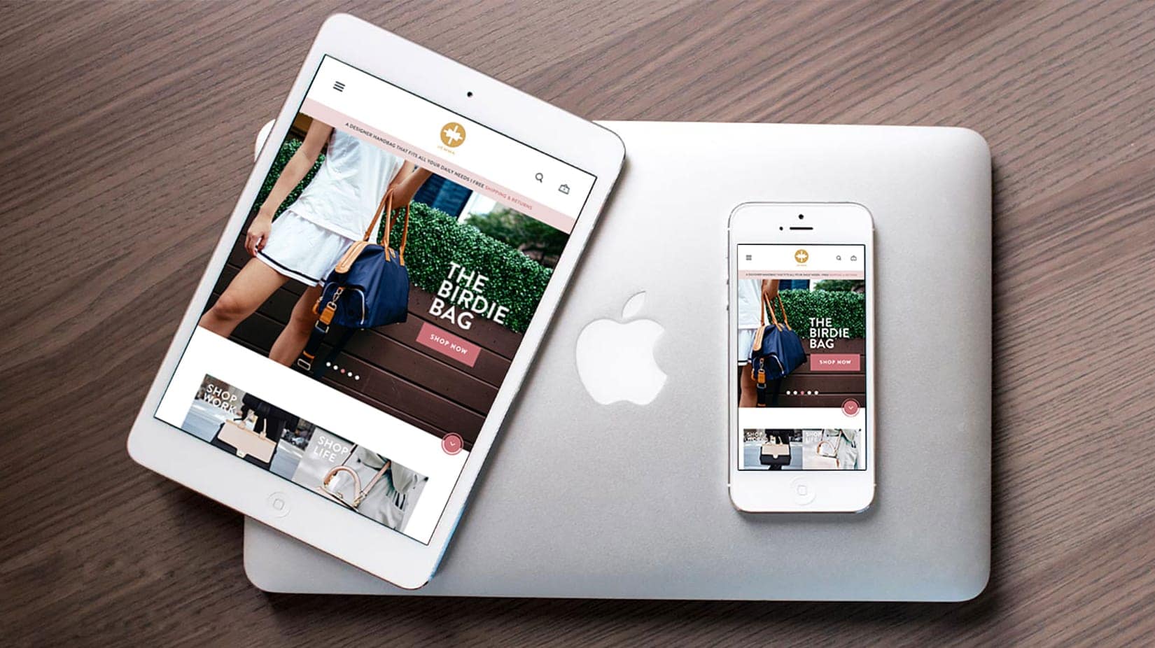
In a world where many people are accessing the internet via mobile devices, responsive web design has never been more...
There are plenty of statistics to support this. For instance, 57% of users on the Internet will not recommend a website that possesses poor design on mobile screens.
In other words, if your website isn’t optimized for mobile devices, you’re likely to lose more than half your prospects. Needless to say, this makes it very clear as to just how important responsive design is.
But, it isn’t enough to just jump onto the responsive web design bandwagon. You see, like most other things, responsive design isn’t a constant. It evolves and changes. You need to make sure you’re updated about those changes in orders to keep staying relevant in the market.
You simply can’t afford to get lazy in today’s highly competitive landscape. So, it’s best to know what’s happening around. Keeping in line with this sentiment, we’ve listed out a few responsive web design practices that are likely to be a big deal in 2018 and further.
Take a look and implement the ones that apply to your site the most.
One of the most interesting things that experts have taken note of this year is the growing use of micro-interactions. If you’re wondering what they are, let us explain – micro-interactions are variables in a design that make it possible for the user to interact with a web page without having to reload it time and again.
A good example of this would be the whole Facebook reactions thing. These are features that have been added to indicate a response to the post. You have multiple reactions to choose from, ranging from a simple like to laughter.
But, here’s the thing – when you react to the post, does anything get altered? Well, not at all. The post stays the same.
These are called micro-interactions and they will soon become key components in the user experience mix. In fact, it has been predicted that 2018 will be the year where they gain mainstream attention.
Mobile designs have come a long way in terms of the coverage they receive amongst mainstream media. Everybody is talking about them and journalists want more attention focused on all things mobile. This is simply due to the fact that most of the online traffic today originates from mobile devices.
But, here’s the thing – you need to separate apps from websites. The responsive design of apps isn’t the same as the responsive design of websites. However, there’s a good chance you might end up working on both of them under certain circumstances.
At this time, what you need to remember is that apps may have components that are identical to what you might use for a website. But, certain semantics will not go down very well in terms of responsive web design. For example, A/B Testing for apps is very different than A/B testing for websites.
We have seen trends where certain grid-based designs were all the rage. For example, we had 12-unit grids, common column amount grids, and the rule of thirds. However, to keep people interested, you need to get their attention in a more subconscious manner.
Grid layouts can be helpful with regard to this. They can maintain the site’s aesthetic value while making it possible for you to incorporate as much uniqueness as possible. This is mainly achieved through various methods of page organization. For instance, you can experiment with column combinations that aren’t too common or even experiment with the white space. You can also play around with the CSS grid; identify new ways to organize pages.
Focus on using a typeface that fits your responsive pages. For example, your desktop site may work best with Helvetica 24 pt. However, the same may not be true for the mobile versions. So, try something else. Maybe Arial is better suited for smaller screens.
There are fonts that do well on a large screen while others perform better on a mobile screen. This is because fonts are inherently designed to appear the way they should, that is, large or small. So, using appropriate fonts based on the screen size makes things far more effective.
However, be careful. You might end up disturbing the aesthetics and even pushing out certain texts. This is where textual hierarchy can be leveraged. Play around with sizes to offer a better experience.
When it comes to colors, the latest trend is to keep things as vibrant a possible. Experts from companies such as Elegant Themes agree that 2018 and onward will be a period of vibrancy. Vibrant colors are what most designers are going to experiment with.
Creative Bloq also published a blog on Flat Design 2.0 and the recent shift towards creating gradients using vibrant colors. It is believed that this is something we’ll be seeing a lot of.
Vibrant colors were rarely relied on in the past due to the simple fact that most mobile screens weren’t up to the task of reproducing them properly. However, that’s not the case anymore. Smartphones have really changed the game and offer several advancements that make design experimentation almost limitless.
Plus, the screens on mobile phones today have evolved greatly, almost eliminating the differences they possess in comparison to larger desktop screens. So, content on smaller screens today is just as effective as it is on larger screens.
So, there you have it – the latest trends in responsive web design. Now, it’s not necessary to actually apply all of them. The key is to experiment and find out what works best for your market. So, some due diligence is required before you simply incorporate these ideas.
Take the time to understand how your market could react to such changes. There’s a slight chance that the industry you’re in and the market you cater to might not respond favorably. So, look for other innovative options.
But, having said that, what we’ve just discussed is likely to work for most businesses as these are the current trends.
For all your responsive web design needs, get in touch with Crafted, one of NYC’s top-ranked digital agencies.
In a world where many people are accessing the internet via mobile devices, responsive web design has never been more...

With rapid growth in businesses everywhere, it is not enough to simply build a website in 2021. In order to...