
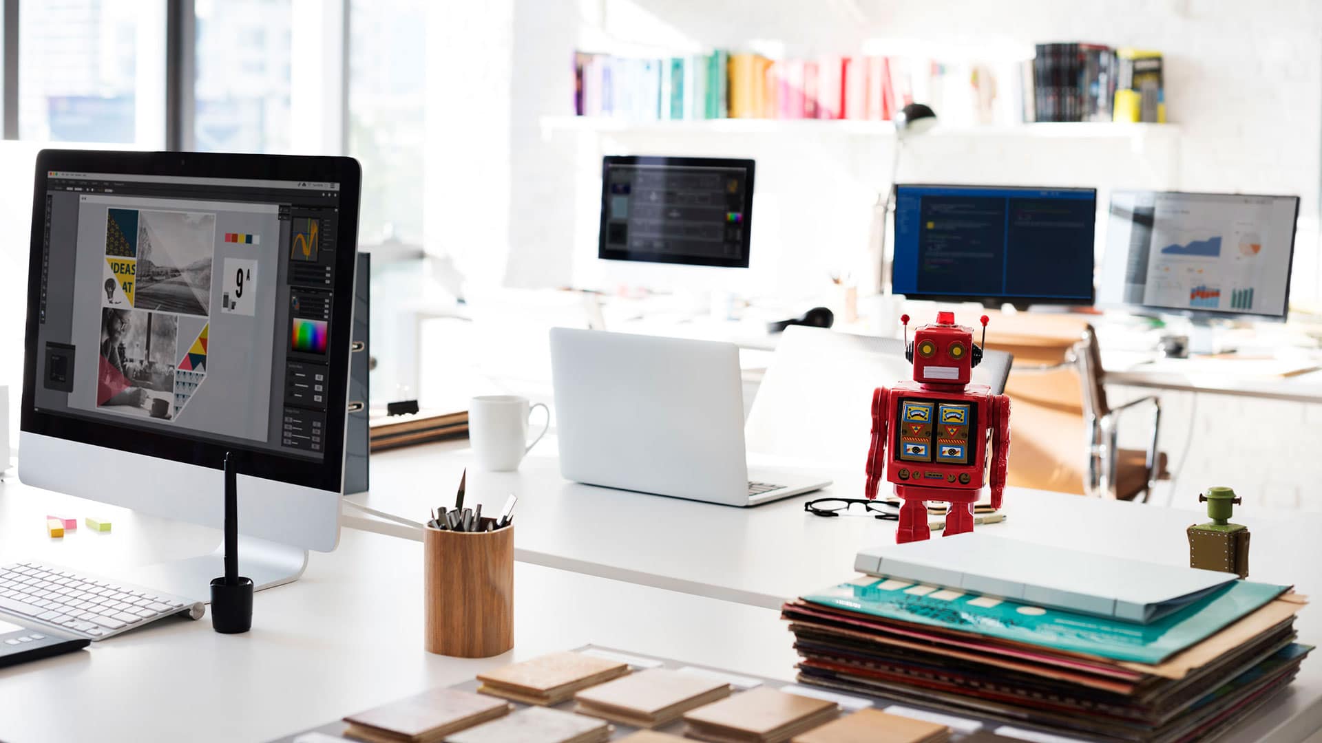
App Design
Native apps vs. Hybrid apps
Are you planning to develop an app for your business? That’s a great choice. According to eMarketer, almost 90% of...
Ever since Google spoke about it in their ‘Google I/O 2014 Keynote’, material design has gained attention worldwide. Today, it isn’t hard to come across designers who apply it not only to their Android projects but also to their other web-bound projects.
Google’s keynote presentation has already been viewed over a million times, and it is still treated as the key resource for understanding everything we need to about material design.
Material design has one goal – to offer users a consistent experience among multiple devices without causing any confusion. In terms of principles, it borrows heavily from print design. It aims to render the physical characteristics of paper into a digital medium, making it possible for an application or website to replicate those characteristics. Like paper, a material design interface can change size and shape.
But, material is only that part which is contained within the application. Any content outside of it isn’t.
The final objective here is portability across platforms with an emphasis on user-initiated actions, such as touch and motion. For example, when an element is touched, it can deliver a digital magnetic reaction, which allows for a perfect transition between the ripples and the reaction itself, instead of delivering two individual images.
Now, before we explore the principles of material design, it is best to determine whether you actually need it. Of course, as always, the answer to a question like this isn’t straightforward or simple. It ultimately boils down to your exact need and circumstance.
But, there is one thing we can all agree on, and that is, great design offers both functionality and uniqueness. Needless to say, the former quality is of the utmost priority. We all know aesthetics is pointless if functionality is compromised.
So, when considering adapting material design, we must first see it from the perspective of our goals. What is it that we are looking to achieve here? To put it simply, is material design likely to play a key role in helping you reach your end goals?
If your answer is, we can begin exploring its principles.
To really understand material design, you will have to start by looking at Google’s official resource. This resource is updated in a timely fashion and hosts all the information you need to build material design.
The Google material design resource isn’t platform specific either. It focuses on more than just the Android-specific stuff. So, you basically have access to information concerning all aspects of material design, discussed in the context of projects in general.
So, start by studying the first few chapters of the resource to get well-acquainted with the basic principles.
The term material design isn’t something that just got conjured up. The very idea behind material design is to create designs that mimic the real world to a particular level of generalization. You obviously do not something overwhelming, where there is no difference between the real world and the one on the screen. The goal is only to express the concept of material.
You see, we all know what ‘material’ is. We know what something feels like even before we touch it. We know what cloth feels like, what metal feels like, or what wood feels like. We can even process multiple layers, i.e. a piece of cloth over another object or paper over an object.
So, with material design, it’s all about using the apt strategies to communicate the same hierarchy of elements. The main thing to remember is that you have to do all this with the most basic design tools, such as shades or shadows.
The best way to adhere to this principle is to select three hues for your primary palette and one color to serve as the accent. The primary colors are obviously for the main elements of the overall interface. This typically includes fonts, boxes. Fields, and backgrounds.
The accent color is the accent color. Its duty is to offer a certain advantage when the main element is being displayed on the screen.
One more thing to remember here is that your accent color needs to be of a higher contrast than the primary colors.
As stated earlier, print design is the foundation on which material design rests. As a result, they happen to share very similar principles. Just like it is with print design, whitespace plays a major role in any kind of material design. It allows improvements with regard to typography and also, layout text.
Whitespace is actually a very important tool when it comes to creating focus and grabbing attention. So, keep things to a minimum and increase the amount of whitespace. Use large typography for the primary headings and don’t think twice about leaving empty spaces in your design.
Google believes that motion adds more meaning to design.
So, when incorporating material design, do not ignore motion as a key component. As humans, we experience motion in our daily lives. Motion allows us to develop a perception regarding how things function and where we need to focus.
The same principle applies to material design, and that’s why motion plays a major role here in boosting interaction. When motion is used, users gain a better perspective of the design’s usability.
There are different elements that can be leveraged to create motion. For instance, when a user carries out an action, you can try to animate the reaction to indicate that the action will deliver the expected results and that the input has been received.
Google suggests extracting colors from chosen images and adding them to the palette. There’s plenty of reasoning behind this, and it would be hard not to agree with the tech-giant. When we use the same colors, we create consistency, which is the primary goal of material design.
There is a strong sense of uniformity with the same color schemes, allowing users to recognize and relate immediately.
Looking to learn more about material design? Get in touch with Us.
Are you planning to develop an app for your business? That’s a great choice. According to eMarketer, almost 90% of...
2020 was a busy year for app design and development, with new trends taking over the market. 2021 is no...