Website Design
The Guide to Responsive Web Design in WordPress
In a world where many people are accessing the internet via mobile devices, responsive web design has never been more...


Many businesses these days often push the ‘Contact Us’ page right to the bottom of their priority list. There have been many instances where the website is immaculately designed, but the contact page fails to do anything to compel the viewer to take action. Businesses slack off on creating a contact page that stands out in terms of copywriting and layout, because of a common belief that the customer isn’t looking for appeal when they decide to contact the business. This is a wrong notion.
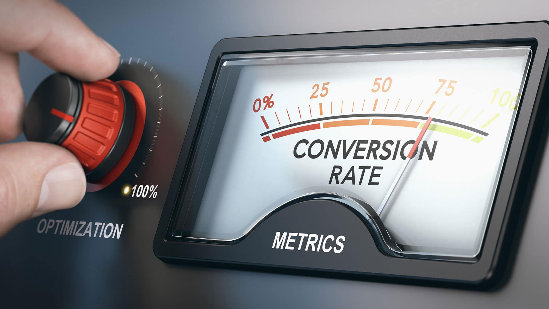
An unappealing contact page can cost a business heavily with regard to a considerable drop in conversion rates. Considering that the contact page is one of the most-visited parts of the website, it should certainly be given due importance with the right design practices.
At Crafted, we understand the major role played by a well-designed contact page. We are a creative agency dedicated to finding the brand's voice and delivering innovative designs to match the brand's personality. Get in touch with us to know more about website design.
Contact UsRead on to know how you can create a contact page that converts and appeals to your customers.
Quite often, a website user might find your content very interesting and may even be persuaded to get in touch with your business to know more about your products or services. In such a scenario, there is nothing worse than having a confusing layout that does not clearly indicate your contact information. The tip here is to use easy-to-understand terms like ‘Contact Us’, ‘Help & Support’, or ‘Get in touch with us’, and place the navigation link in a prominent position on the website. This also acts as a visual prompt that can effortlessly guide the users to take action after they have visited your website.
Many companies choose to separate their contact page and support page on their website. While this works to keep the two functions separate, it may discourage website users from getting all their answers from a single spot. It is highly advisable that your contact page design contains solutions for self-service knowledge as well. Hootsuite does an excellent job of centralizing their contact us page to offer customers whatever they need. You can also add in links to FAQs and your social media pages to catch the customer’s attention. Of course, while centralizing all contact options, the page’s aesthetic value must not be lost. Keep everything simple and minimal so as to not confuse the user.
Sometimes, a customer may reach your contact page to have a simple query answered. Other times, they may be looking for an in-depth solution to a problem they can’t seem to navigate themselves. Your contact page should provide options for both. A common email address or phone number would not be suitable for all types of customer care. Instead, you can design the website in a way that allows the user to navigate easily to find help with what they’re looking for. A simple ‘What can we help you with?’ tab, with answers to multiple common queries linked down below will help users find answers much more easily. You can always guide the user to get in touch with a customer care representative for more information. Don’t forget to provide a link for the same.
A big part of good and thorough customer service is to anticipate what the customer might need and provide a handy solution in advance. Even when a customer reaches out to your website with a query, they may be wondering when they can expect a response. Let’s face it – there have been several times when we have written to businesses and haven’t received a reply even weeks later! The best way to diffuse this uncertainty is to include when exactly the customer can expect a response – that is, if your business doesn’t offer real-time support. You can include copy that says – “You can expect a reply between 9:00 a.m. to 5:00 p.m. Monday through Friday’, or “Feel free to write to us. We reply back in just a few hours.” These simple additions can go a long way in building the customer’s trust.
Many customers click on the contact page to get an immediate response to a query, and many of them lose their temper when they’re met with very manufactured replies, even if that’s protocol. The best way to navigate this issue is to show users that there are real people helping them with their queries rather than just robots. A lot of websites choose to feature photos of their real customer care team members along with a name. Some other websites use fun graphics of their customer care agents on the contact page. Either way, you will be humanizing your customer care team and improving the user’s chances of being more polite in their interactions.
The contact page of your website is absolutely essential when it comes to ensuring higher conversion rates. Customers today expect a seamless and interesting virtual experience, and investing a little bit of time and effort into designing an eye-catching contact page can surely take the customer experience to the next level. Remember to keep the page design clean and minimal, while still engagingly incorporating your brand’s personality. The last thing you would want is for your customer to find an overly-cluttered and confusing contact page, prompting them to click off from your website altogether. The way you communicate with your customers is essential, and a well-designed contact page is surely a reflection of that.