
Design
Say Goodbye to Endless Revisions: Visual Feedback Tools for Efficient Design Approvals
The design approval process. It can be a source of frustration for both agencies and their clients. Endless email chains,...
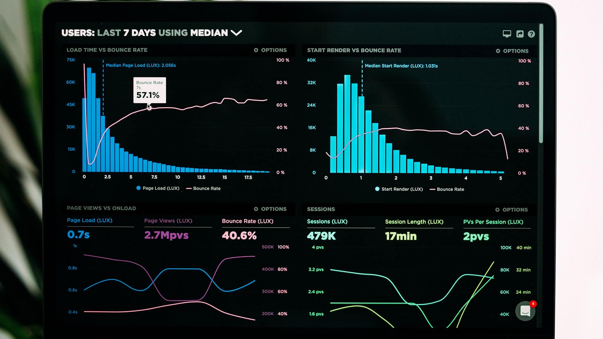
Data Visualization is the process of representing raw data in visuals for easy interpretation by readers. Visual representation through elements such as infographics and graphs makes a better impact on readers. They grasp details that may not have been so readily visible to them through lines of text.
By designing simple and impactful data visualizations, website and app owners can experience better user engagement and improved conversion rate.
From large enterprises to fast-growing startups, we help every organization to employ the latest and the most efficient branding strategy for improved user engagement and competitive advantage.
Contact UsData visualization brings a difference to content presentation, leading to improved content consumption. So, what aspects of data visualization make this form of presentation more desirable than others?
Given here are key reasons why data visualization can be key to the success of your websites or apps:
Web and smartphone users tend to scan information than read them through. If you present them with data details in the traditional text way, they are more likely to leave your webpage or app.
Information that is harder to understand will hardly keep readers engaged. Your audience is looking for relevant information. When you deliver such information in an easily understandable form, you are delivering a good brand experience.
Data visualization helps present any data, from simple to complex, in a simpler format. Audiences do not have to take the mental effort to gather and connect different data points and derive the insights they need. Data visualization delivers the insights they need, directly. (A data point refers to a unit of information).
For example, a real estate property app can benefit from data visualizations that enable subscribers to understand the latest property trends. They can make sound decisions about investing in appropriate real estate depending on the insights derived.
Representation of data in text and limited visuals such as graphs, tables, and pie charts, were enough for internet users in the earlier days. The world today is more drawn to visual elements such as rich images, graphics, clear audio, and streaming videos.
The world is becoming more and more visual in its taste. Visuals such as memes and photos are the way people are communicating with each other.
Given this content phase, your customers expect you to present data in visual formats. Data visualization helps you address this customer need.
With data visualization, you can use a range of tools such as infographics, heat maps, bubble clouds, maps, bar graphs, and more, to improve your customers’ website or app experience.
Mobile apps are becoming a lifestyle and business must. There are apps that make every task integral to your customers’ lives easier and more efficient. From banking apps to apps that manage remote services and even entire business systems, apps are becoming indispensable tools for performance-boosting, monitoring, and decision-making.
The use of data visualization in such cases is more of a need than an afterthought for mobile apps to deliver the required functionality effectively.
Analyzing and understanding search engine results is often a complex process. Sometimes, you may miss some invaluable insights due to the inadequate presentation of data. A misalignment in SEO data analysis can lead to erroneous interpretation, which can be costly for your website or app promotion.
SEO visualizations can help you present your data in a more analysis-friendly format. Representing all relevant data in visual formats helps you understand the pattern governing your SEO results. For example, you may discover that a new backlink is performing extremely well. You may have missed this information with your traditional analysis methods.
You can also use SEO visualizations to understand which keywords are performing better. You may identify that a specific keyword is helping you achieve your intended SEO objective better (e.g., lead conversion, sales, etc.).
Another area where SEO visualizations can empower you with actionable insights is that of competitor analysis. You may have enormous data telling you about your competitors’ websites. But such information is of no use unless you find an opportunity that helps your website or app stay ahead.
SEO visualizations enable you to achieve more clarity on the data, understand patterns, identify flaws, and discover hidden opportunities where you can make a difference.
Deciding on the best visualization for your data is crucial because a wrong choice will convey a wrong message, which affects your brand value. For some data, a simple infographic may work while some data demand a more complex presentation.
Here are some data visualizations that can work effectively depending on your data and the message you want to convey:
Word clouds are a powerful visualization tool to understand the importance of a specific word within a group. The greater the frequency of a word, the bigger and bolder it is on the word cloud. Tag clouds are used to understand keyword patterns.
This visualization presents data in the form of rectangular columns. They are great tools to study and compare data across inter-connected sets. Bar charts are so popular because they make information-grasping easy.
Line graphs are effective when you are using a variable and continuous parameter such as time. They help you identify patterns and trends. These visualizations employ colors for better data analysis.
Heat maps provide ratings in addition to conveying the relationship between two parameters. Different colors or shades are used to specify the rating. Color types or shades may vary to describe a range such as high to low or satisfactory to excellent.
A sparkline representation can best be described as a graph without the horizontal or vertical axes. They are extremely efficient for faster communication of your intended message. Sparklines are great tools to identify trends.
Scatterplots use dots to represent data points. These visualizations are ideal tools to identify relationships between two dissimilar numeric variables. A scatterplot helps identify elements that do not belong to the set. They are also efficient at explaining data distribution across predetermined variables.
Bubble charts are effective at showing how two or more elements are interconnected. Each data point is represented as a bubble. One of the variables is often a location. These charts are great when you want to study data based on location. Different bubble sizes are used to indicate varying values.
Another great tool to use when you are representing location-specific data.
Data visualization removes the tediousness out of numbers, statistics, and data, and helps you create an interesting story and perspective out of them. Visualizations are becoming indispensable tools to make websites and apps more engaging and personalized for your audience. Adapting to these incredible tools can keep your business well ahead of others.
The design approval process. It can be a source of frustration for both agencies and their clients. Endless email chains,...