
App Design
Native apps vs. Hybrid apps
Are you planning to develop an app for your business? That’s a great choice. According to eMarketer, almost 90% of...
Designing an app is all about making things as easy as possible for the user. It’s all about striking the right balance between creating a visually stunning interface and dreamlike functionality. Users expect intuitive, easy to navigate interfaces that load fast and include minor details that add a hint of uniqueness.
But, if you step out into the real world, very rarely do app designers manage to strike this balance. Everywhere you look, it’s mostly the flat aesthetic that Apple and Google have, pretty much, appropriated as their own.
In a way, this is fine considering that familiar designs lead to better adoption rates among users. However, the flat aesthetic hasn’t solved any problems. We just have a different problem now – the problem of having to stand out by exclusively fooling around with photography and illustration.
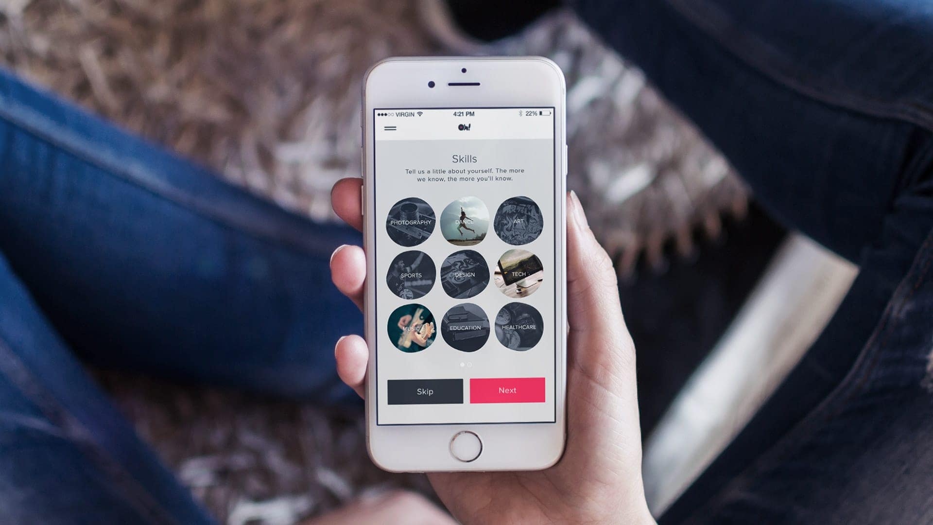
In this blog, we are going to look at how you can use imagery to make your app stand out since that’s pretty much all you can do these days.
This cannot be stressed enough. If your app relies heavily on showcasing imagery, then, for heaven’s sake, use high definition photos. Almost every smartphone that comes out today boasts an HD screen. So, make the most of this.
If your images are going to look fuzzy or pixelated, you will not be taken seriously. That’s just the truth. So, start focusing on high-quality images.
But, of course, don’t go overboard with this. Remember, you also have to factor in load time. The last thing you need is a slow app. So, optimization is the way to go. However, if you do have to slow down the load time, do it creatively. Make the waiting period a little more tolerable. For instance, a progress bar is far better than nothing.
One of the most basic rules of design is “get rid of the clutter”. This matters even more for mobile apps because space within which they operate is very small. So, you need to create a lot of room for breathing.
The more buttons and things you add, the more difficult it will become for the user to do things. So, when it comes to interface elements, dial it down a notch or even several notches depending on how cluttered it is.
Users need to be presented with only what matters. Nobody wants to see elements that have no relevance to their main goals. The average user wants to complete his/her tasks as fast as possible and as efficiently as possible.
They do not want to fiddle around with a dozen buttons or enter in tons of data. No matter how interesting some features might seem, if they have no real use, they shouldn’t be there. Just because something is unique doesn’t mean it’s useful.
When incorporating elements of animation, make sure they’re being put there for a reason. For example, some apps will use subtle animations to indicate transitions. Sometimes, these animated elements may add to the personality of the app.
Animated elements are definitely appealing and they can do wonders for your app. But, they need to be purposeful. In most cases where animated elements proved to be a success, there was always a function behind the addition. For example, in most apps with animation, the animated element represents a change in state.
Some animated elements are associated with core functions. For example, a sliding icon may indicate that the tool or feature within the app is hidden or closed.
You can also use animated elements for the purpose of making your app feel more human. For example, a funny animation that keeps the user entertained or distracted before loading a function or feature.
Consistency, with regard to functionality and visuals, is extremely important. The appearance of the app needs to be unique and coherent, irrespective of how subtle the elements might be. Users enjoy familiarity. Familiarity provides comfort. So, make navigation more intuitive and simple.
Now, in the context of all things visual, this would apply to everything from buttons to typefaces. But, also assess the use of images. Take a good look at the style of the image/images selected, the role of the image/images in the interface and how often they show up.
Apart from that, focus on external consistency as well. You have a certain image that you need to adhere to. So, make sure your app blends in with other elements of your brand image such as websites, blogs etc.
Another major aspect of app design is the consideration of touch functionality. Your app is, after all, designed for devices that come with a touchscreen. So, you need to follow certain rules. For example, Apple insists on designing buttons that are no bigger or smaller than 44×44 pixels.
Basically, make sure you add or remove pixels to ensure that the user enjoys maximum touch functionality. In other words, try to prevent the user from pressing anything else.
Make sure there is an optimum amount of space between the various interface elements, especially the buttons. Having them too close to each other opens up room for erroneous touching. Too much space just might end up causing aesthetic issues.
Consider various screen sizes as well, especially high-end phones with large screens. These phones are a little difficult to operate with one hand, which means certain elements within your app might be harder to reach.
Even if you can’t put every button within accessible range, consider making just the important (more likely to be used) buttons more accessible. Less important or even risky buttons such as the ones used to send out delete commands can be kept out of reach.
Most apps are organized in the form of a list and this is usually done in a hierarchical manner. The most important elements are placed in critical positions, while the least important elements may not even be immediately visible.
There are multiple ways in which you can establish this hierarchy. For instance, size can be leveraged here. Important buttons can be made bigger while less-important ones can be made smaller. Even a color-coded approach can help establish a hierarchy.
So, there you have it – a few basic rules on managing imagery in app design. Follow these rules and you will get closer to creating an app that offers a stellar user experience.
Looking for an app designer who can create an app that adheres to the above-mentioned rules? Well, Crafted can help you out.
Are you planning to develop an app for your business? That’s a great choice. According to eMarketer, almost 90% of...
2020 was a busy year for app design and development, with new trends taking over the market. 2021 is no...